

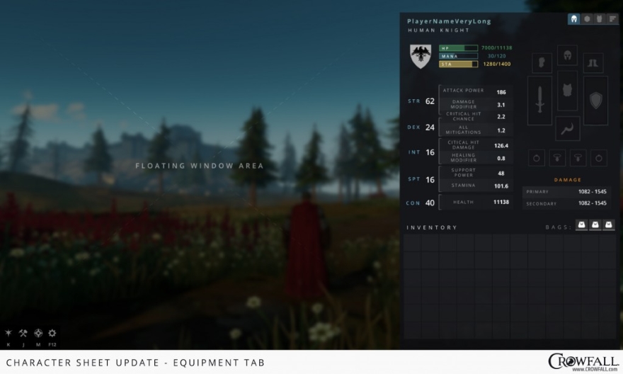
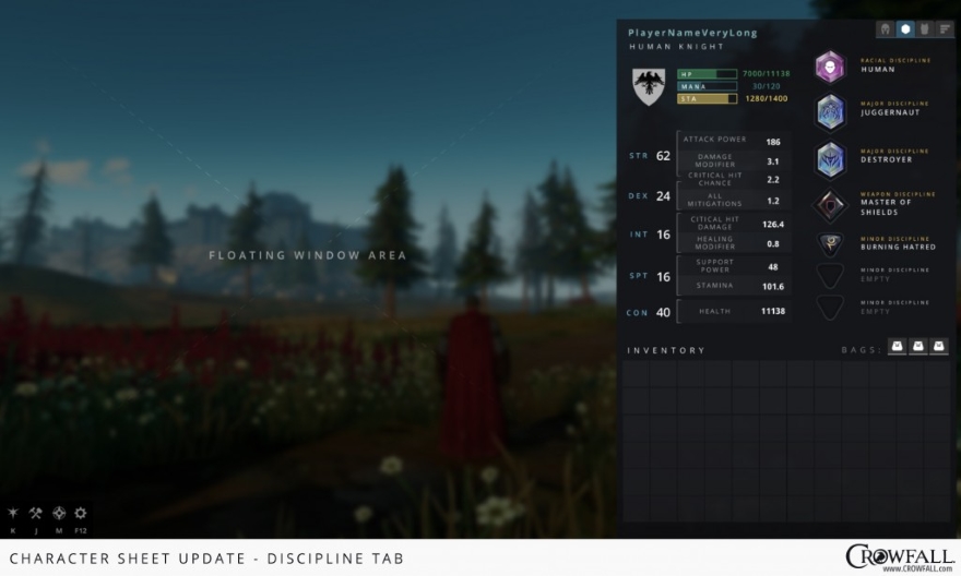
“Boxy and functional” is not usually a compliment unless you want to get slapped or are describing a Volvo. But when it comes to Crowfall’s new user interface screens, this is sincere praise indeed.
Today, the team previewed its work on some of the user interface screens to the community, which are crisp, boxy, and (yes) functional. Apparently these screens also streamline excessive UI: “Most of you are experienced with how the current layout exists, with separate windows for inventory, character information, and equipment. The new design combines (and condenses) these elements with a built-in tab system that allows you to view multiple pieces of information at one time… in less screen space!”
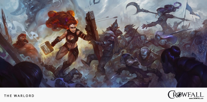
ArtCraft also recently posted a gorgeous piece of concept art that is meant to relay to the viewer what this game is about in a “visceral” sense. Bet you anything that it’s waiting for you after the jump. Any takers?


")


