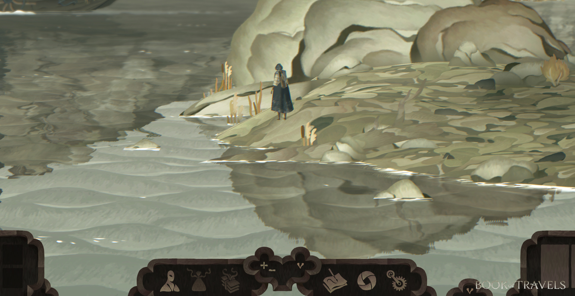
One of the selling points of Book of Travels that originally caught my eye way back before its successful Kickstarter last year was its interface, which evokes the same parchmenty, dreamy aesthetic as the rest of the game – and frankly looks more like a pretty set of RPG character sheets than a video game. That makes Might and Delight’s latest dev blog a treat indeed, since it focuses entirely on the UI.
“Our idea is to make a somewhat classical interface that leans on many conventional solutions found in other games,” the studio writes. “But we also want to do it our way, adding flavors from the game’s ethos.”
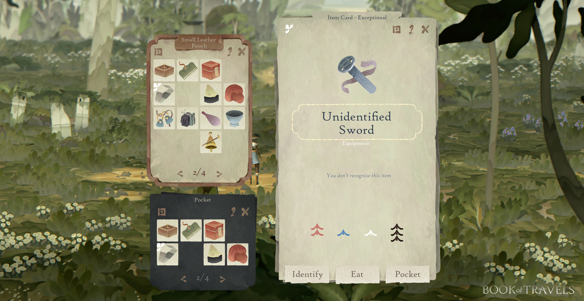
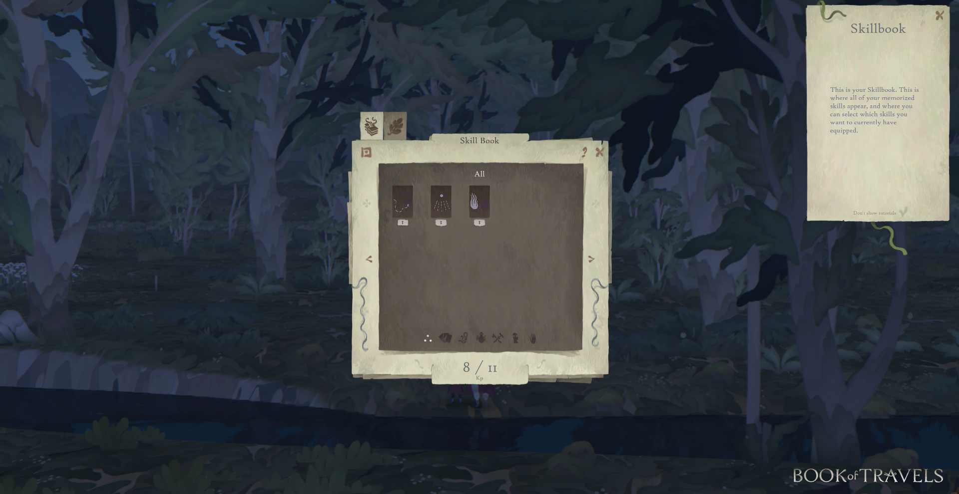
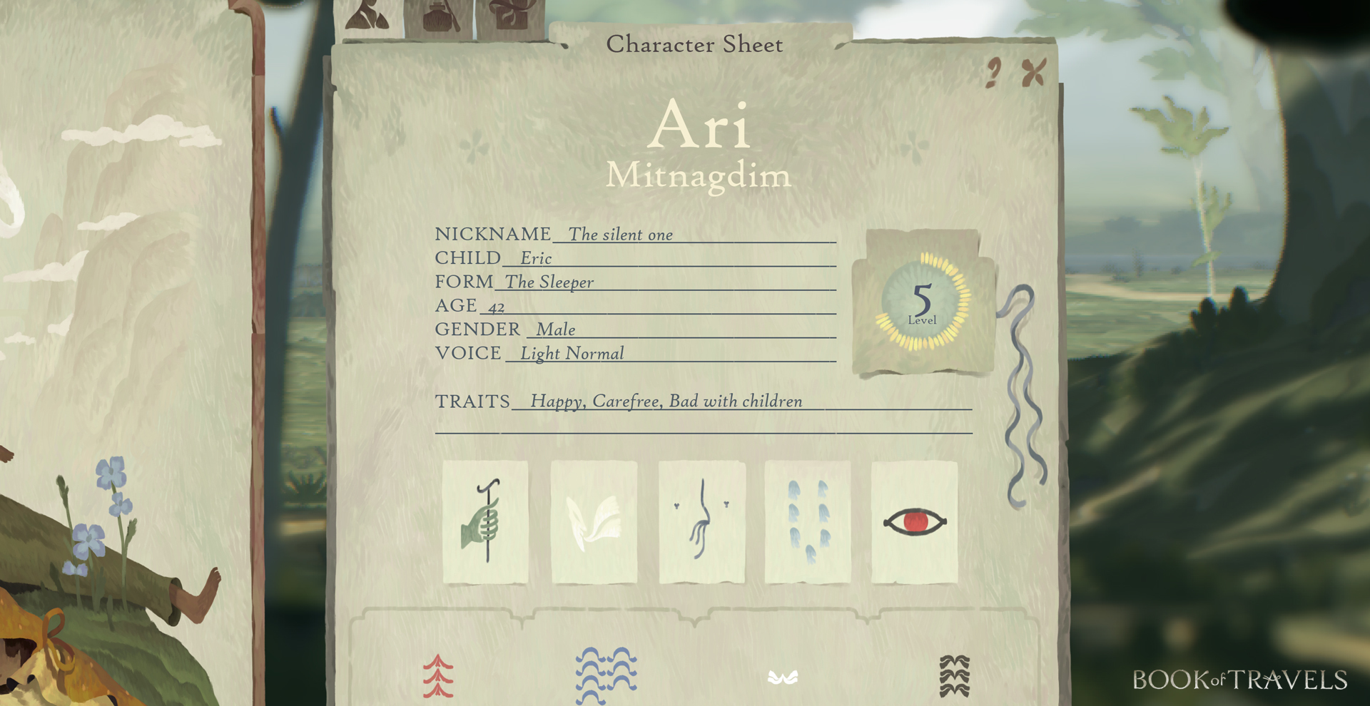
“One example is that we are using a lot of icons and symbols instead of text – not everywhere, and not only, but often. Together with inspiration from classical pe and paper roleplay, the style makes for an interesting mix of traditional and new. To get around the annoying inconvenience that symbols can entail, one can always press the question mark to read about a particular UI-screen or use mouse over to write out the name of symbols. The look itself is inspired by paper and cards. Items and Skills are presented as cards and when creating your character you get to choose between different background cards that tell the story of your character. Being able to bring life to your character through its personality is vital for us, and we have added in many options to write your own custom information besides the choices of traits, origin and other factors that you must choose.”