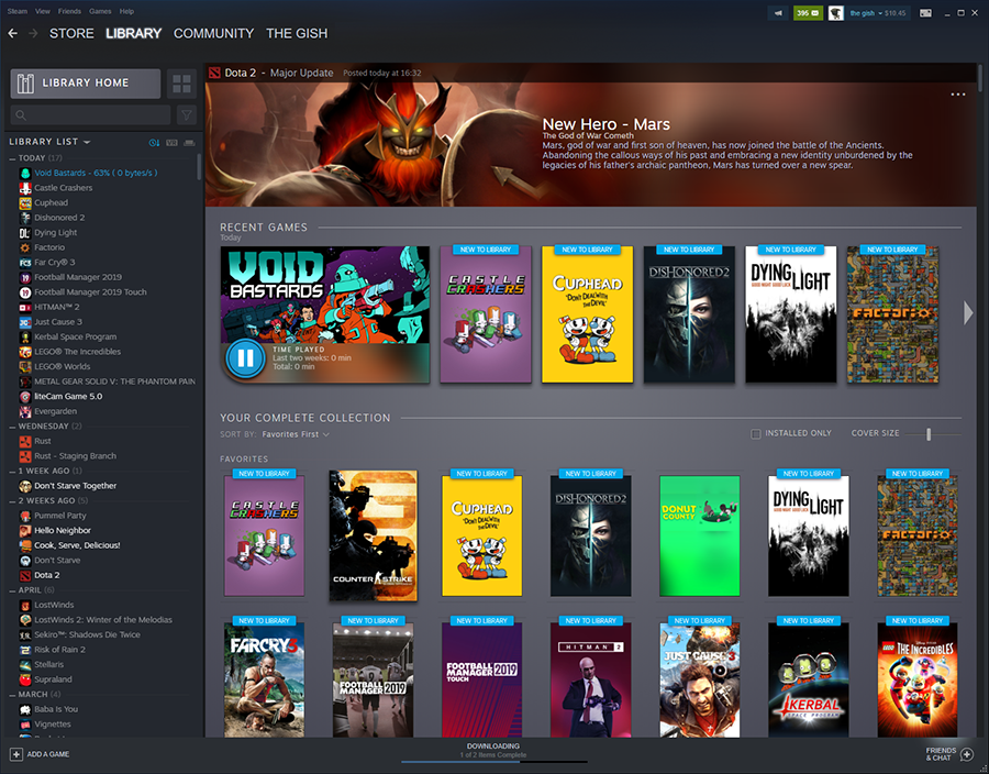
It’s been hard to gauge whether Valve is feeling any pressure from the likes of Epic and Discord when it comes to its Steam presentation, but regardless, the company is working on enhancements for the platform’s app all the same. In a new post this week aimed at developers, Valve showcases exactly what the new Library panel’s going to look like.
For users, it’ll pull all games into an overview splash page sort of view, with vertical icons for everything that look more or less like classic video game box slides. The current Library has nothing like this; I rather like the visual (in fact, it kinda looks like the way I set up my own PC’s game library folders).

Drilling down to an individual game, you can see Valve will be deprioritizing achievements (they’re there as a clickable, just not displayed) and news in favor of more clearly showing Workshop mods and friends who own the game.

Developers are being asked to update their art assets on Steam to match the new styling.


