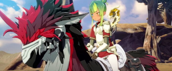
As Dauntless pushes through beta and toward launch, the team is hard at work refining its user interface to strike that critical balance between being seamlessly integrated with the game’s art style and providing useful information on the fly.
The team said that it is giving increased focus to the UI right now, taking cues from Halo 2’s matchmaking system (which it labels “humanity’s greatest achievement”) and figuring out the UI for game controllers. Other UI projects include transmog, customization, cosmetics, color blind options, status effect icons, quick crafting, and rebindable keys.
“The art of user interface is providing immediate and relevant information without creating a distraction or incongruity,” the dev team said. “It’s important to us that our UI is snappy, fluid, and intuitive.”


