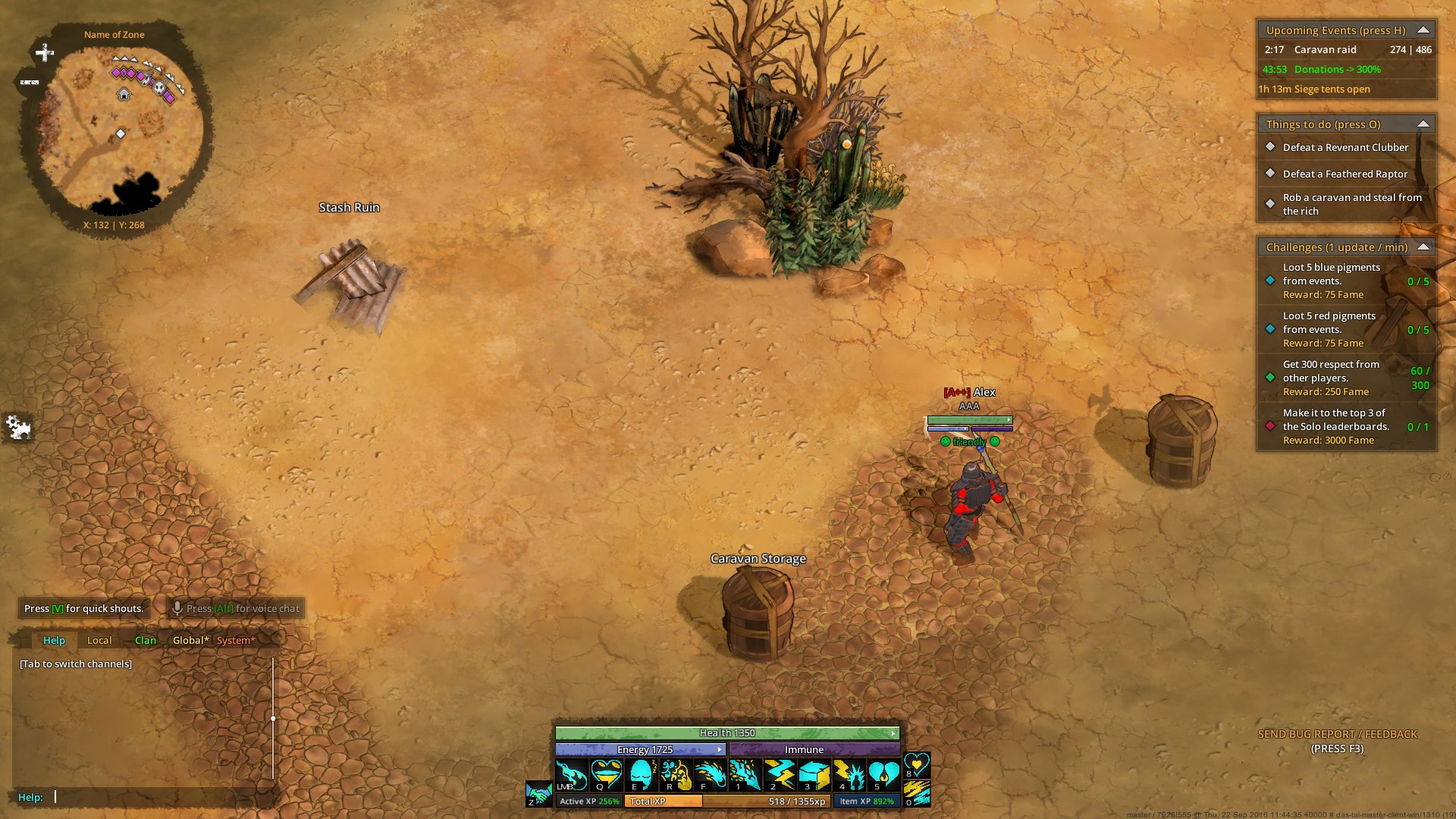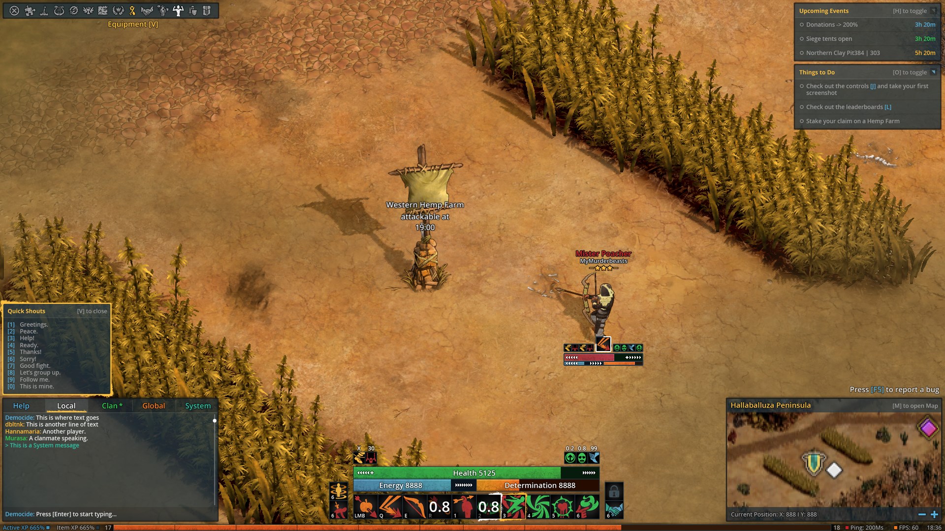
Indie PvP sandbox The Exiled, formerly known as Dal Tal, is in the middle of a massive upgrade to its user interface. Fairytale Distillery’s Alexander Zacherl says that the team’s been quiet for the last few weeks, “heads-down in the development of the game for the next alpha,” but today, the devs are showing off the game’s new heads-up display.
“The mini map moved to the bottom right and it got a lot more space. It also now mirrors the screen ratio which makes it easier to show your relevant surroundings. The menu bar finally has more room. When we put it on the left side of the screen years ago it only had a couple of buttons. Now that is has grown considerably it needed more space. The XP bar is finally decoupled from the skill bar. It closes the screen off very nicely and we even managed to fit in a clock, FPS and ping display that is always visible. There are a lot of small tweaks that make text and buttons more easily readable. And of course we have massively re-structured the on-player UI (name, health bars etc.). Those will not always be as massive as in the picture above. We are going to configure it in a way where it disables it’s child elements when not used. So no cast icon or debuffs when you are not in combat. No health or energy bars when you are full anyways.”
The studio says the new HUD should roll out to player testers “in a couple days,” with more UI tweaks (“a complete re-design of all in-game windows and then of the out-of-game menus”) to follow. We’re including the before-and-after shots below.


