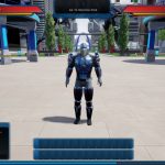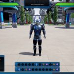
The UI matters a lot in an MMORPG — at least if you’re going to be staring at it pretty much constantly while you’re playing the game. So what should the Ship of Heroes UI look like? Yes, “like the City of Heroes UI,” the game is already there on that point. But what about colors and positioning? That’s what the developers are asking with the latest dispatch from the development team.
Two different early versions of the UI are available for fans to examine, mostly differentiated with colors for health/resources and the style of the game’s hotbars. Future would-be players are invited to offer feedback on the game’s forums about which version looks better and which one no one should ever want to use, although it’s hard to make many long-term decisions based solely on UI screenshots. You’re supposed to hide the UI before you take screenshots, after all.


