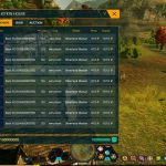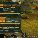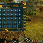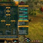
Here’s the short rundown on Otherland’s UI: It’s terrible and the developers know it. Unfortunately, for a long stretch of the game’s current management, it’s been allowed to remain terrible simply because redesigning it is a big chunk of work that the team hasn’t actually had the time or manpower to swing. But now the team is sitting down to do the hard work necessary to actually make for a good and usable UI, starting over from the ground up.
The plan is to not simply reskin the old interface but completely redesign it, as the team shows off in the first few preview images. This also gives the design team the opportunity to add new elements to the UI to make the game easier to play on top of prettier to look at. It’s not new content, but it is the sort of thing that makes existing content more satisfying to play through, so it’s ultimately a net win.


