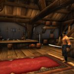
Computers get faster and better with time. Graphics that require a decent GPU in 2011 can be displayed at much higher resolution in 2019 if you’ve upgraded your hardware at some point in the intervening eight years. World of Warcraft is kind of hitting up against this issue at the moment as players are seeing the first screenshots of World of Warcraft: Classic, now with the benefit of computer hardware not assembled circa 2005. Heaven knows it looks better to my eyes than it did back when I was playing vanilla.
Of course, that brings with it a new set of issues; it’s easy to look at the game looking better and think “ah, they’re using the redrawn models from later expansions, that’s why it looks better.” And while it’s true that certain things (the client’s graphical options) are ported over from the live game, the actual models and graphics are all vintage, right down to the maps.
But you don’t have to take my word for it. Let me show you.
First, let’s take a look at a Night Elf model, named Cynara, made at level 1 on both versions of the game. Because the lighting in old Teldrassil is as bad as it is, I included one color-adjusted shot of her without any gear equipped, just to make the differences in texture and model as clear as possible. I would also stress that the graphical settings for both versions of the game are identical, and while I might not have gotten the colors exactly right, the goal was remaking her as the same character in both versions.
Well, that’s pretty indicative. Look at her forearms, look at her skin textures, look at the light sourcing for her eyes. Her pose is similar, if not identical, but across the two versions you can really see the difference in both the texture map and the overall model design. It’s clear as day.
Next, let’s take a look at an Undead, going by the name of Trichael. Amusingly, the light in the crypt is actually better than it is in Teldrassil… and equally amusing, at least to me, is that you actually start outside the crypt in the post-Cataclysm world.
Boy, the posture feels like it changed a lot, doesn’t it? But you can still see the differences between the two at a glance. The bones are better arranged and jointed in the newer model, have a different color to them, and the forearms and chest are both telling of the work that went into the redesigns. Heck, you can even see the stretching around some of the skin, gross though that may be.
Last but not least, let’s go on a quick tour through Stormwind. I chose this because, well, there are some features that are notably different, and this is just a quick peek through the stretch that goes from the inn over to the weapon store.
Yes, that blank house is where the auction house is in the current game! And the poor weapon master is altogether gone in the modern game, since weapon skills are no longer an issue. You can really tell the differences here, even with only a couple character models on display along the way.
Of course, none of this will matter if you already believed the repeated statements that the game is using the old data in terms of both maps and character models. But if you thought otherwise, hopefully seeing it side-by-side proves it to you.

