I fully admit to being obsessed with the user interfaces of pretty much everything, from my phone to my PC and of course every game that I play. So Crowfall’s latest dev blog is right up my alley, as it deep-dives some of the major changes en route to the game’s interface as teased last week.
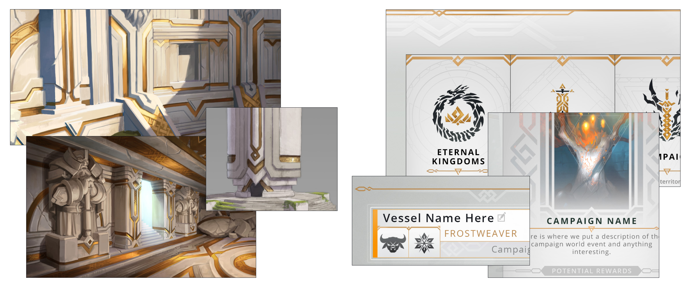
As ArtCraft explains, its early versions focused on an extremely clean and minimalist interface in contrast with the world, but as the game’s development has progressed, the studio has aimed to make the two jibe a bit better, and that’s meant new touches representing the history of the lore, specifically the Stoneborn race and the Dying Worlds ruins – it’s still light and clean, but there are golden Celtic-leaning flourishes and borders now, so instead of flat, simple buttons and windows, there are faint borders and textures that make it look, well, a little more artful.

The studio further digs into the Vessel selection screen’s information-oriented revamp, tweaks to the World selection panel, and the Faction selection window, which I first read as Fashion and am now slightly disappointed about.

“Our user interface journey in the Lobby will spill into the HUD and in-game menus soon,” the studio says.


