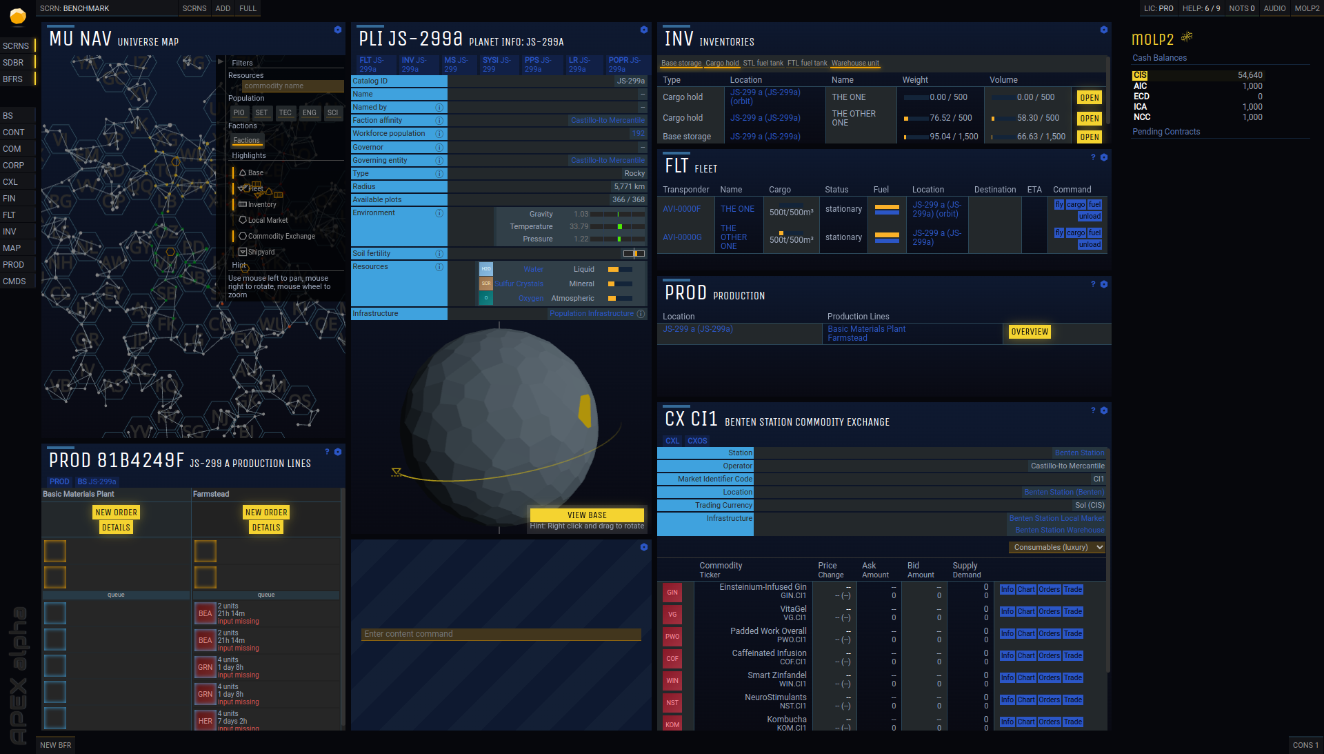
It’s easy to feel as if the UI in any game isn’t really a big deal because… well, it’s just the UI. It naturally feels just a little less important. But the UI is how you interact with the game a lot of the time, and that’s important. So it’s a good thing that Prosperous Universe is changing its UI to look less like a field of unbroken greyscale boxes with white and occasional blue text and more like a well-designed interface with darker blues, gradients, and so forth. This is especially good because Prosperous Universe is a game played entirely while being nested knee-deep in its UI, so it’s the equivalent of a full graphical overhaul.
Moreover, the game’s UI is changing the sizes of various text boxes and commands so that the eye is more naturally drawn to actual commands to click instead of just a solid field of text. It’s a subtle set of changes but it makes the redone UI immediately look nicer and easier to read, so check out the full preview for a better sense of how things will be changing. Sometimes a minor change is all you need, but sometimes a big change is lots of minor changes.