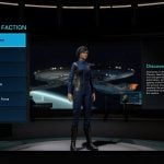
If you’re still upset over the impending loss of the Star Trek Online player-made quest Foundry system, make this will perk you and your imagination back up: PWE and Cryptic just announced that they’re heavily revamping the character creator UI.
“The character creator is one of those features you see in games that started out simple, and worked fine when it was made, but as new factions and species were added to the game, it quickly got bloated and overwhelming,” UI Artist Jo Gianulis explains. “My first goal was to clean up the UI and cut down on the visual clutter. We used to just throw every option at you all at once on one page. When I built my first character I was so excited to see all the options, and the LCARS were so immersive, but I was so overwhelmed that I had to walk away and come back to it later. We wanted to take away that overwhelming feeling, while still giving you access to all the options you wanted.”
The retooled UI aims to keep the “spirit” of the old UI while making it way more obvious and easy to actually pick which style of pointy ears and eyebrows and head width you want. Plus there are plenty of quality-of-life tweaks as part of what Gianulis is “hoping this will just be the first of many polish passes for older UI systems in the game.”
She does note that the tailor UI isn’t changing – just the character creation. We’re here for Space Barbie. More like this please devs.
We've done a complete redesign of the Character Creator on PC – come and check out the changes here.https://t.co/OOBGH8lqLX pic.twitter.com/2d9HTNlcOt
— Star Trek Online (@trekonlinegame) March 7, 2019

