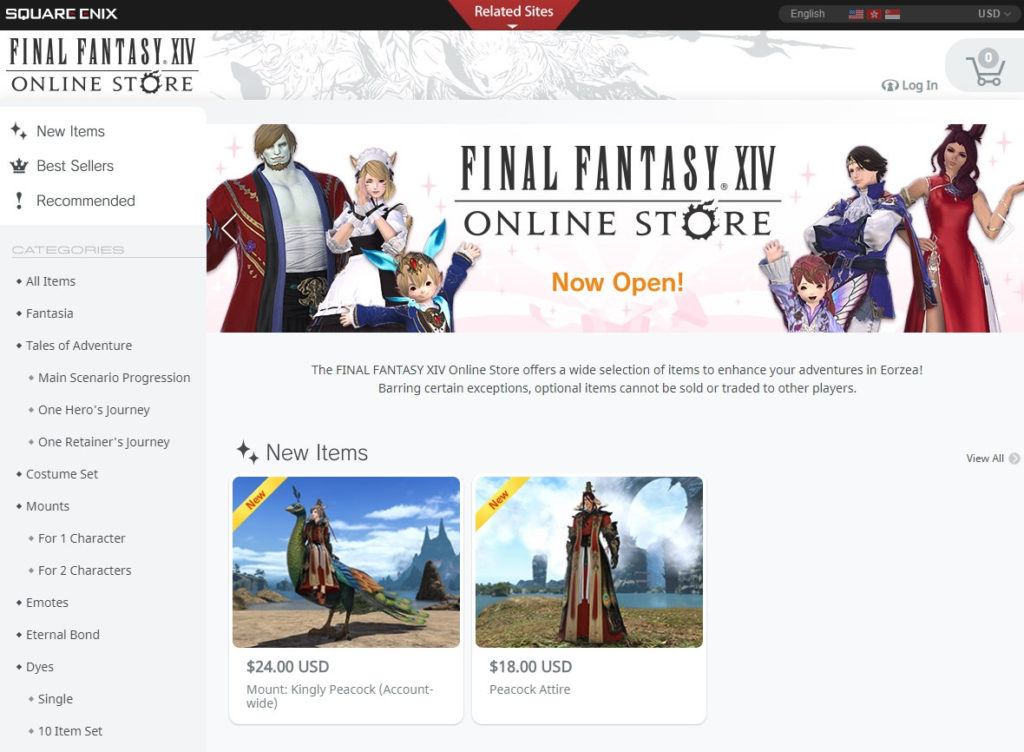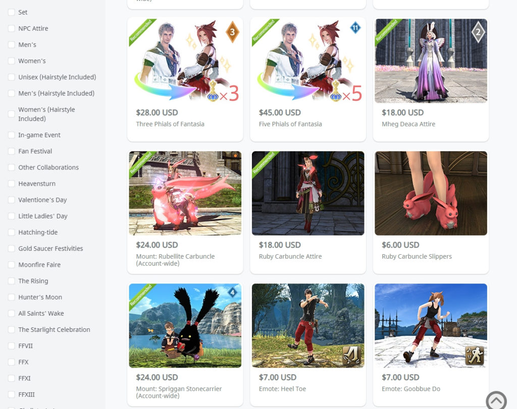
The Mog Station interface for buying optional items in Final Fantasy XIV is awful. Like, regardless of how you feel about the presence of cosmetic outfits you can buy, the actual interface is just terrible. So it will no doubt come as a welcome change that the entire interface has been redesigned, starting by allowing you to see everything available for sale without logging in first. (Which was annoying.)
The new interface also loads faster, has a clean listing of categories so you can go to the sort of thing you want quickly, allows you to filter items easily, and so on. It’s a massive improvement over the prior interface on every level, so if you have a great deal of irritation regarding the fact that the microtransaction store exists in the first place, this… well, probably won’t actually mollify you very much. But at least it’ll make browsing through it that much easier.


Source: Official Site


