

When I returned to World of Warcraft Classic in 2019, I steeled myself to be vastly underwhelmed by the visuals. I’m not a graphics snob, particularly with MMOs, but I know that I had gotten used to the ever-increasing polygon count of retail WoW and how lush and good-looking that client had become. It was inevitable that going back in time was bound to disappoint.
Except that it totally didn’t. Sure, WoW Classic’s visuals are a whole lot more simplistic and, to put a term on it, “chunky,” but they also hold up way better than I anticipated. I’ve spent a whole lot of time in both vanilla and in WoW Classic examining the visual makeup of the world, and I wanted to share three key observations for how Blizzard’s art team took a rather low-poly environment and made it look timelessly good.
Exaggerated design
Every MMORPG has its own visual design, which I think of as split between realism/stylism and natural/colorful. A realistic and natural game — even a fantasy one — portrays the world in normally expected proportions with a color palette that mimics the real world. This was pretty much the standard in online games until WoW came calling with highly stylized and abnormally colorful graphics.
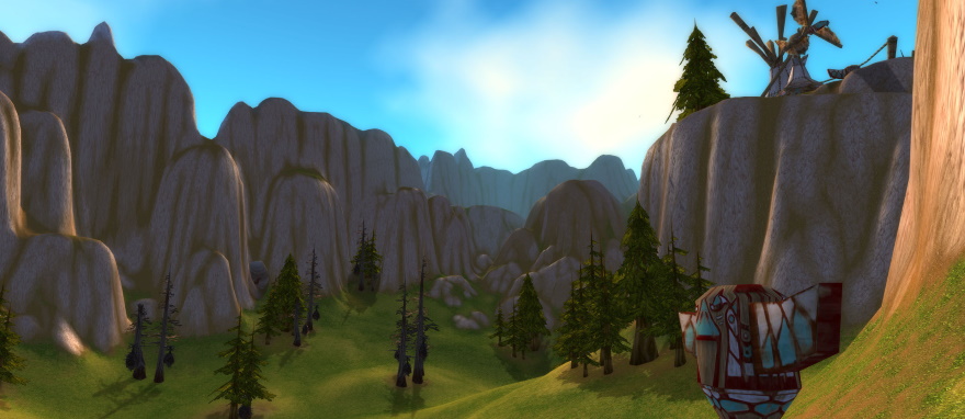
Everything in WoW Classic is exaggerated. It’s not ludicrously so — future MMOs would take this even further — but you can see it pretty much everywhere you look. Straight lines and boxy buildings are not the order of the day; rather, everything is at an angle (even a slight one) and given to greater proportions than we typically see in “serious” MMOs. It’s a totally cartoony, Dr. Seuss-like look that came out of Warcraft III and cemented the personality of this game world.
And when you’re dealing with chunky, lower-poly graphics, leaning into the chunkiness turns a disadvantage into an advantage. WoW has such a distinctive look that you instantly know what you’re looking at if you see a screenshot on passing. Furniture and buildings are both bigger and smaller than they need to be, and even characters and their (shoulder) armor bear signs of this design philosophy.
Artistic textures
But chunky and exaggerated effects only get you so far. The next layer of WoW’s particular style comes from the textures that are slapped onto these bulky constructions, and it’s here that I think Blizzard’s artists did some of their best work.
I mean, think about it. You only have so many polygons to make any particular object, so you can’t use them frivolously. Instead, you make textures that simulate the illusion of depth without actually changing the shape of the object on which it is laid. I noticed this my first week in WoW’s beta when I saw how the artists created fake shadows for low-lying farm plants so that, to the passing eye, you were running over a bumpy, plant-filled field rather than a completely flat plane with tiled stickers all over it.
WoW Classic gives you an awful lot of time to look at the scenery, and once you start noticing this, you’ll see amazing textures everywhere. I’m so impressed by how the artists could make wood planking or brick fireplaces look varied and interesting rather than utterly forgettable. The textures don’t just add fake depth and cover up chunkiness — they also add a whole lot of personality to the game world.
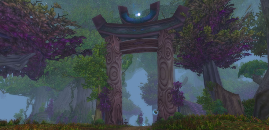
Here’s one example that I picked out. It’s a vaguely tribal or eastern arch that you’ll pass under in Ashenvale. But look at the wood textures compared to the trees next to it. In most every other MMO, the wood of the arch would feature straight plank lines or be a featureless brown. In WoW, the artists took the time to give it this delightfully swirly pattern that suggests that this wood was cut from different trees or that the builders took the time to carve this design into it.
It’s just one small example, but it shows how this technique can be used to infuse an object with eye-catching personality.
Movement and lighting
The last tricks in the WoW Classic artist’s toolkit are subtle movement and lighting. Let’s talk about movement first, because it’s really not something I’ve paid close attention to until relatively recently.
Have you noticed that so much of World of Warcraft’s world moves? I’m not just speaking of the characters, which never quite stand still (they’re textbook fidgeters), but of all sorts of world objects. Lamps on posts will sway slightly. Two-dimensional planes of grass will sway when your character walks through it. Even big mushrooms can be observed to give off a faint spore dropping now and then.
Lighting is more obvious and appeasing to the sight, and there’s a whole lot of it in this game. Times of the day each have their lighting settings, as to be expected, but there are all sorts of smaller touches of applied lighting that help to give places more depth and personality. Again, another small example, but running through the many tunnels between Loch Modan and Wetlands, the subtle lighting of the fires give those tunnels a warm and welcoming glow — like it’s a taste of civilization that’s still maintained.
World of Warcraft’s visual design was one of the very first things that ever drew me to this MMORPG, and I’m still delighted in observing it even to this day.
 Stepping back into the MMO time machine of WoW Classic, Justin Olivetti offers up observations and ground-level analysis as a Gnome with a view. Casually Classic is a more laid-back look at this legacy ruleset for those of us who’ve never stepped into a raid or seen more than 200 gold to our names.


