At the same time, there are a few gameplay changes that would undoubtedly help improve EVE Online‘s long-term retention of new players if CCP Games would commit to investigating them. War declarations need a serious overhaul to allow groups of friends to safely form social corporations, for example, and lone players should ideally be directed more forcefully toward corporate recruitment.
In this edition of EVE Evolved, I look at four relatively low-impact changes which I believe could have a positive impact on new players and long-term retention.
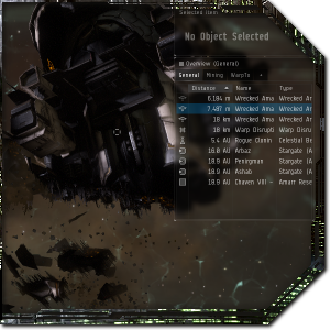 Default overview settings
The overview is the single most important piece of user interface in EVE Online, and yet it has quite poor default settings. It’s a tiny little spreadsheet crammed in the upper right corner of the screen and all players eventually expand it to cover a large portion of the right hand side of their screen, so why not make it easy on new players and expand it a bit by default? The default overview profiles are also less than ideal, with three tabs named “General,” “Mining,” and “WarpTo” that aren’t half as useful as the profiles players tend to create once they have more experience in the game.
Players tend to create tabs for enemy drones to help during small scale PvP, for loot and salvage to avoid cluttering up the screen while fighting, and special setups for specific PvE or PvP tasks. We assign colours to hostile targets so we can see them more easily in local chat and in the overview, and disable certain bracket icons to avoid accidentally clicking the wrong thing. There are some fantastic standardised overviews out there such as the Zirio-Syundai pack that players can install with just a few clicks and which CCP could point players toward, but we could definitely use a better standard overview pack designed in conjunction with players and the CSM.
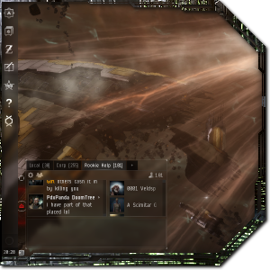 Default window placement
For a game that relies so heavily on social interaction, it’s always surprised me that EVE starts with the chat channels squeezed into a tiny corner of the screen. This affects not just the social aspect of the game but also a new player’s risk to PvP, because the local chat channel is really an intelligence-gathering tool that lists everyone in the same star system. Most players separate the Local channel from their chat stack and stretch it up the left hand side of their screen so that they can see when a new player enters the system, and everyone expands the remaining chat window to make them legible.
Every window in the game has its own default placement and size and they all overlap, so the clutter can get pretty extreme when you’re exploring the market or doing industry while also fitting a ship or looking up info on modules. Most players do eventually cobble together something resembling a clean interface on their own while including all the necessary windows, and the level of UI customisation available is definitely enough to help them do that. Better default positions that don’t overlap would help new players, though, as might grouping certain obviously related windows by default (such as the Market and Wallet windows).
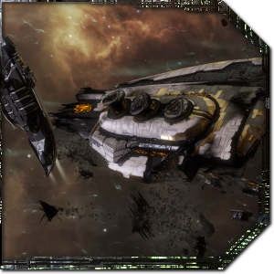 Default camera settings
The camera is admittedly a small thing that may not be measurably affecting new players’ experiences of the game, but it’s still something I change when logging in for the first time. The default camera settings have an odd slightly narrowed field of view and an option called “Dynamic Camera Movement” enabled, both of which seem intended to make the game look more cinematic. The dynamic camera definitely helps convey a sense of speed when accelerating and the narrow field of view improves the sense of scale in the tutorial area, but most players turn them off for normal gameplay.
I personally find that the narrower field of view makes most areas in the game look cheap rather than cinematic, and it exposes the limited resolution of the background nebulae. I would propose rolling all of this stuff together into a new Cinematic camera option that is enabled during the tutorial, and then having a part of the tutorial get the player to use each of the main camera modes so they know the options available. A dedicated cinematic camera option would also allow CCP to exaggerate some effects without messing with people’s usual gameplay, just like they do with Abyssal Deadspace.
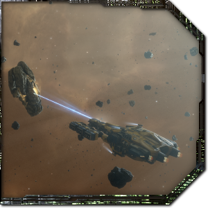 Non-combatant corps
I’ve written several times about the events that make players quit EVE Online and the factors that prevent newcomers from sticking with it in the long term. Some players quit after a catastrophic events such as the collapse of a corporation or losing a prized ship to a suicide gank, while others simply don’t enjoy the slow pace of the game. I’ve always considered EVE Online to be more of a long-term social hobby than a game, though, and we’ve known for years now that the single biggest factor affecting a player’s retention is whether they get involved in the community and join a group.
With the obvious exception of the solo Abyssal Deadspace feature, much of the gameplay added in recent years has been focused on enabling small groups and corporations. The problem is that most young corporations will eventually find themselves on the receiving end of war declarations that they aren’t prepared for. The most effective way to beat that war is to disband the corporation or log off for a week, neither of which is ideal.
The single biggest intervention I think CCP could make to help young corps and new players get established would be to add a new non-combatant corporation type that would be immune to war declarations but can’t build Upwell structures and may have other limitations. We’ve already seen the effect that a similar intervention had when CCP added the ability to disable friendly fire within corporations and corps began recruiting new players more actively. I think this change would have a similar effect for small corps and groups of friends who come to the game together.
It’s often difficult to see what factors affect how a new player experiences their first hours in EVE Online, but those first moments inside the game are undoubtedly important. With some relatively low-impact changes to the default overview and chat settings, new players could get a much closer gameplay experience to the one they’ve seen on streams and videos.
Having seen several fledgling corps collapse at the first sign of war, I also strongly believe that allowing corporations to opt out of wars would be a huge benefit. There are plenty of existing players who would rage at this idea, but players can already opt out of wardecs by staying in an NPC corporation. All this change would do is allow players to retain the social and shared identity aspects. What do you think? Are there other changes that CCP might be overlooking when it comes to improving the game for new players?
 EVE Online expert Brendan ‘Nyphur’ Drain has been playing EVE for over a decade and writing the regular EVE Evolved column since 2008. The column covers everything from in-depth EVE guides and news breakdowns to game design discussions and opinion pieces. If there’s a topic you’d love to see covered, drop him a comment or send mail to brendan@massivelyop.com!

