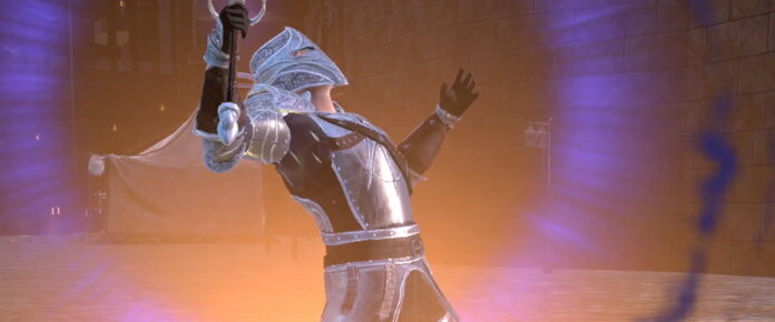
I’ve been inside of Craftopia once before, having taken a look at this weird yet colorful survivalbox back in 2020. Since then, I’ve dabbled once or twice after the fact but never really bothered to get completely invested. That decision seemed to be the right one when developer Pocket Pair announced its seamless world update in 2021.
Now, after just under two years of development, that seamless world update has gone live for the early access title. And that seemed like the right moment to return to the game and find out whether it has hit the reset button on the world or just added more problems to an already janky piece of gaming.
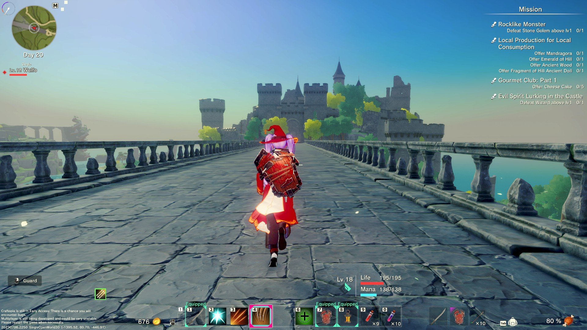
While we’re on the subject of resetting the world, I’m happy to report that you still start the game off by pushing a button and blowing up the Earth. Except this time around, the destruction is a whole lot prettier, and the button you push is much nicer-looking. I know that seems like a weird thing to get hung up on, but it also illustrated to me that the game had indeed made a big leap forward; it’s a thoughtful little touch that kind of set the table for how different things would be.
Sure enough, different has absolutely been my experience to this point, and the changes have been for the better. While roaming around the small starting island was fine enough when I previously was in this game, I didn’t really have much cause to explore since things were pretty condensed and moving to new realms meant building and enhancing a portal to link to new instances. This time around, my wanderlust was immediately engaged as I was looking out over a massive horizon and things out in the far distance, and then I was encouraged to wander by the mostly hands-off approach to the starting section.
I suppose my ease of jumping right in to things was helped by having played Craftopia before and also instantaneously recognizing the game loops of its contemporaries like Breath of the Wild and so many other survivalboxes before. Despite that, though, the starting beats felt right and intuitive, with just enough handholds to guide you along via small mini-quests that nod to what you have to do in order to craft items and explore the world. That’s not to say that pop-up tutorial windows weren’t anywhere, as those immediately sprang across my screen every time I picked up or created a new weapon type, but overall starting off felt more like guardrails were put up instead of a tunnel forced around me.
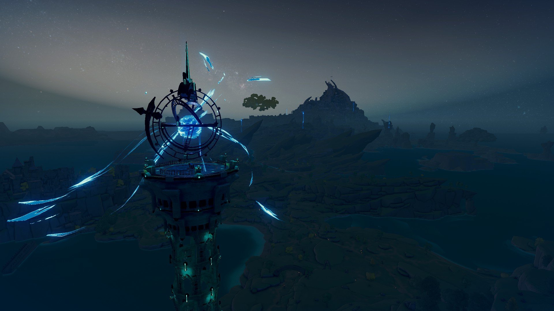
Of course, not everything has completely changed. The primary goal is still to feed materials in to an important monument in order to progress the world’s time forward into a new Age, which in turn unlocks more things to craft. This progression is also still just as weird, entertaining, and baffling as it always has been, as you move from basic stone weapons to firearms to flying machines, as well as more and more automation options.
But even this has changed a bit. This time around, you first have to provide specific materials to a tower location in three different stages, then use different advancement keys to actually progress an age forward. These keys are dropped from bosses in specific dungeons dotted around the landscape, and finding these dungeons is primarily done with following a specific quest NPC who generally guides you along to a rough idea of where to go. Failing that, you can always just explore the map yourself if you really want to: The tower locations themselves are giant beacons of light that can be seen for miles around, and each tower is generally surrounded by the materials you’ll need to craft the items it wants to consume to grow. It’s a pretty elegant solution that encourages roaming the world or following the breadcrumb trail.
As for personal progression, that’s still mostly linked to earning levels and completing quests to get advancement points, which can be spent on different trees to enhance melee combat, unlock magic spells, or provide buffs to things like stamina, health, or mana regen. The floating islands in the sky also make a return, though that now has an Anubis who will grant you permanent stat buffs or give you recipes and advancement items when you turn in advancement slates or soul orbs. These two currencies are an interesting new wrinkle to progression, and once more encourage both wandering to find soul orbs in the world and completing quests to get advancement slates.
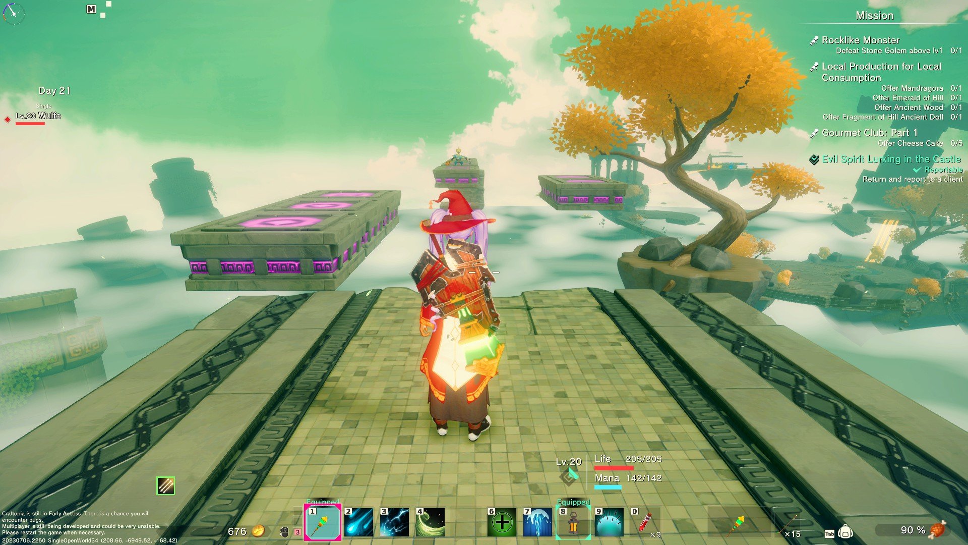
Moving back to the the subject of dungeons, I can say those have changed for the better too. Gone are the very basic single tunnels that lead into a boss fight, as we now have some much larger sprawls that feature little puzzles, platforming segments, combat rooms, or a mixture of the three. None of the puzzles really challenged, but it was still a whole lot more engaging than ever before.
Another welcome change is the combat, which feels much tighter than the last time I played. It still seems pretty easy to aim your character in the wrong direction as they swing madly at open air, but it also feels a little more firmed up and focused. This is helped by a lock-on feature (default Q) and a significant emphasis on dodging through attacks at the right moment, which engages the ability to pull off a power move. Furthermore, the weapons all feel great and have wonderful variance to them. I’m rather partial to the magic staff myself, though I still can swap out to a sword and shield if things get too hairy.
While Craftopia has made a lot of advancements, there are still lots of problems to be had. One of my biggest pain points is building, which is an agonizing and frustrating experience of having to deal with aiming building pieces from the ground or by climbing on the walls like some feral beast. Trying to build a pretty house while your feet are planted on the ground is agony, and sometimes the building pieces just refuse to go where you want them to, either because they disappear when your character is too close or they just will not link together without any explanation.
There are several other problems as well, such as the camera in the game being very bad. You’re not able to zoom out your view for some insane reason (which really hurts when fighting some of the larger monsters), and there were more than a few combat encounters where I couldn’t see what was happening because the camera was crammed into my character’s skull or shoved against a wall. Additionally, the translations are still wildly inelegant in a lot of cases, I have run in to a few full-on crashes, and the game’s multiplayer still feels a bit rickety; the only solution offered by the devs is using a codes feature to play with friends.
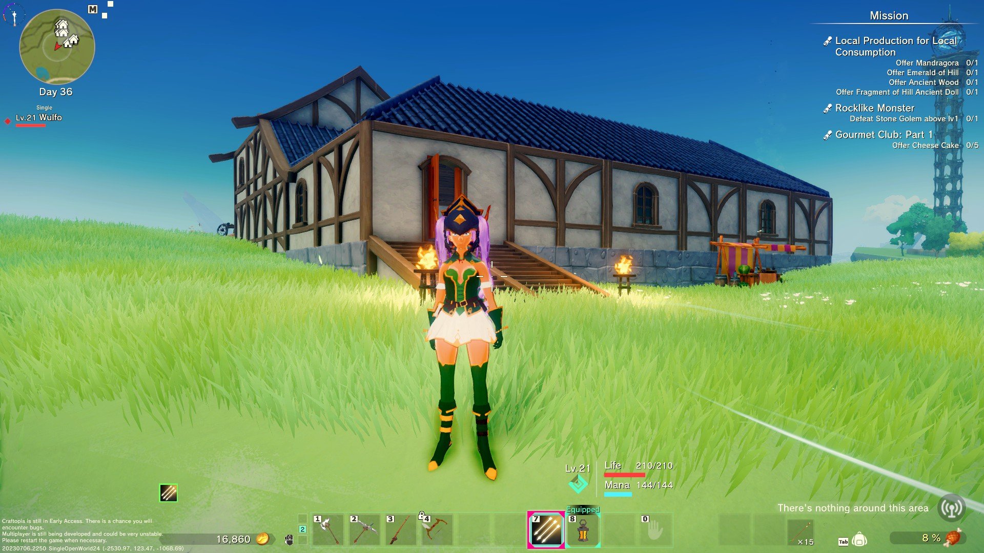
Overall, Craftopia still feels like an incomplete package and so might not be worth the price of admission for those who are averse to early access games. In spite of some of its rough edges and lacking quality-of-life features, I still find myself playing nearly every single day and losing hours to this game when I do. And in the end, this is an early access game that has made a significant leap forward in its development, which I argue is the best anyone can ask for out of an early access title.
The seamless world isn’t without some little tears, but it is a huge step in several right directions and a significantly improved game from the last build. I cannot wait to see where it goes next.

