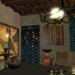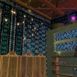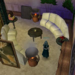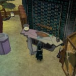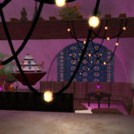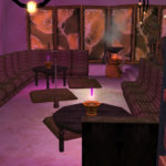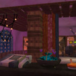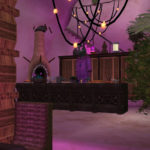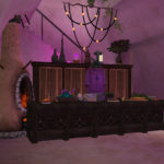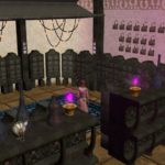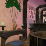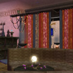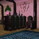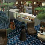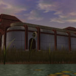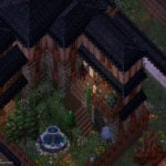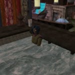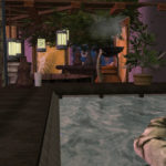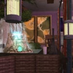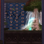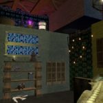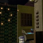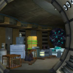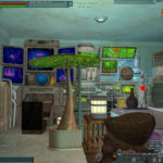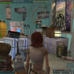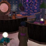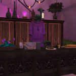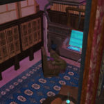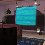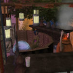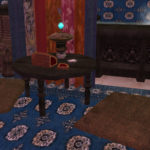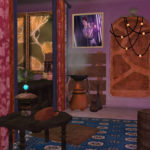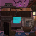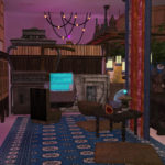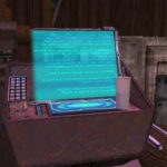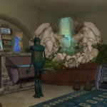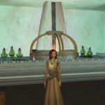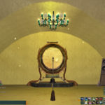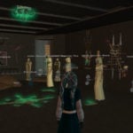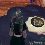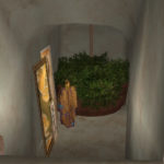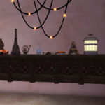
I’ve been mulling over how to do a piece about MMO housing for a while now, spurred on by colleagues and readers who’ve said they wanted a tour of my house in Star Wars Galaxies Legends. I didn’t want to just dump out a video of my latest house as if to beg for compliments, and snagging video of other people’s houses on the server proved overwhelming because frankly there are just too many gorgeous buildings in that game (plus, I’d only be duplicating the Homeshow).
But then a weekend or two ago, a stranger dropped by my house as I was decorating. He was there to buy food, but he poked his nose into my workshop area to say how much he loved the house and how every room was different but still tied together – you know, like a good house in real life. The conversation, coupled with wasting way too much of my life reading way too many design blogs, unwittingly gave me inspiration: The compelling thing about MMO houses is that you can usually go wild (and never have to worry about ugly closets, bathrooms, or dust), and yet a lot of the design principles we’d use for decorating a real-life space still apply. Best yet, a lot of these rules and tricks for designing and decorating apply to all MMOs with housing, not just SWG Legends. Here’s how I do it. (Also, there will be hot tubs.)

Think outside the box (house)
If you’ve ever played any version of The Sims, you know that the temptation is there to just build a big old square and fill it with your crap. It can certainly be an effective way to play, but it’s not pretty. Nobody wants to live in a warehouse in real life.
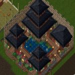
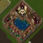
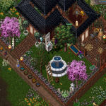
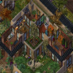
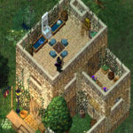
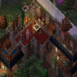
Ultima Online has similar temptations since players are free to build any structure they choose on their rectangular plots and housing is so limited that naturally we want to maximize our space. It’s a mistake, though, that leads to endless 18×18 houses built like a layer cake stacked four square floors high. So I try to make the best of my space, to create a semblance of an outdoor yard, to build in sections rather than think of my whole lot as the whole house. Inside, I make sure to create lots of smaller rooms and spaces; that gives me more walls for storage and more places to tuck interesting pieces. (As in real life, big rooms that aren’t decorated well can trick you into lining your walls – and nothing else – with furniture.)
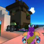
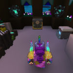
The same temptation exists in Trove, particularly because the individual player houses are usually functional (you can plop one down while out adventuring) and should be built with high walls to prevent mobs wandering in. My main house in Trove is built to look like a small tower; its actual floorspace is less than half of the lot, and it goes up and up with lots of windows and nooks and crannies, just like a real house. (Trove doesn’t screenshot well, I fear!) Even though Trove and UO have very little in common, I borrowed outdoor spaces again – water, in all four of these houses – plus I used my little trick of a contrasting wall setting the house in a bit from the true edge of the lot, like a fence around a yard.
Death to open concept
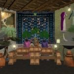
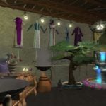
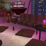
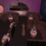
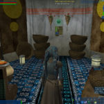
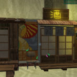
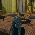
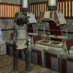
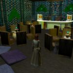
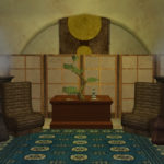
If you’re stuck with a premade house with premade rooms – and let’s face it, that’s what most MMOs with housing do have – then you can use furniture to divide up a too-big space. In real life, that means making sure your sofa is counter-intuitively in the middle of the room rather than on a wall, or using curtains or backless shelving to create the feel of blocking off a room into smaller areas or scenes. But if you’re in a free-form building type of game like EverQuest or Star Wars Galaxies, you can literally just build your own walls out of stuff not meant to be walls at all. These next two batches of shots are from my homes in the original SWG, and believe it or not, both of these buildings are natively the tacky silver-and-red diner from Attack of the Clones. I’ve used curtains and cabinets and tables to split one big room into three areas in my old Starsider diner (more on the tricks in this building in a bitsy).
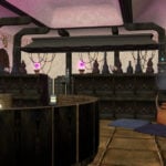
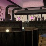
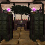
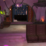
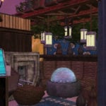
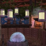
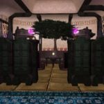
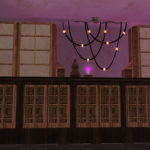
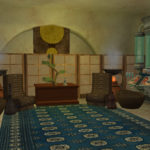
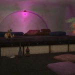
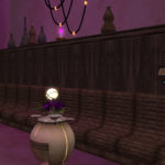
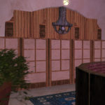
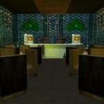
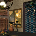
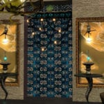
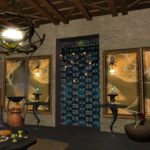
In my old Bria diner, I used dozens of stone fireplaces (for the walls), tables (for the floors), rugs (for the doors), and pallets (for the ceilings) to create three rooms (a shop area, a sitting room, and a craft room), completely masking every inch of diner underneath. I haven’t always been successful at this, I hasten to point out. None of this is easy, and I usually build mostly bad houses that result in one good idea that I can take to the next attempt. The last two pics below are also from an old house of mine on Bria, and to my eye, using rugs and screens alone to divide the space looks a little fake and forced, chiefly because the rugs float in the air and never really sell the idea of being walls. Contrast that with first two pics, where the rugs perform the same function but nest into the faux walls and ceilings and feel more credible (even though you could walk right through them).
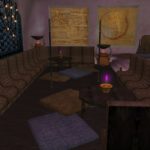
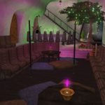
In my current SWG Legends house, I’ve tried to section off not just horizontal but also vertical space. Over a sunken floor area, I raised pallets below the ceiling to make the space feel smaller, more cozy. But it also creates extra contrast with the other half of the room near the stairs, which now feels even taller – something you can emphasize by respecting that scale and putting objects up high to draw the eye.
Don’t like it? Mod it out
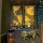
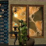
If you’re lucky enough to be in an MMORPG that allows modding, then you’re even more free to make your space your own. Part of the reason the first diner I showed doesn’t look anything like the red-and-silver diner that actually existed in SWG is that I modded the textures to replace them Tatooine and Jabba-style textures. True, the house wouldn’t look quite the same to folks who didn’t have my mod installed, but it was my workshop where I spent 95% of my time, so I didn’t care. I also modded the storage units to match. Here are a few more shots, combined with some pics of one of my (far uglier) earlier versions, where you can see the original textures.
There’s a bonus shot of an old UO house above too: See the weird little landing step up to the porch? That was also a bit of a legal hack job, accomplished with an axe, a crafting station, and a whole lot of tatami mats stacked and wrecked in just the right order. Not all modding is external! And incidentally, that earlier 2009ish attempt at decorating my diner didn’t work at all. The colors are a wreck and the decor and rugs are too busy. The green clear dividers make the space feel chaotic, not separated. Examples of what not to do!
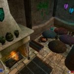
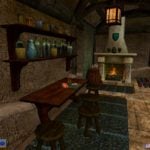
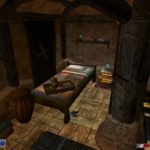
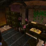
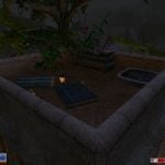
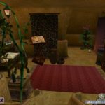
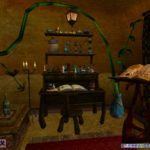
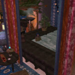
I’m amused to note here that I’ve used these tricks in non-MMO games too: Here are a couple of houses I put together as a Morrowind mod many years ago.
Plants, water, wood, light
You might notice that I have a clear design theme to my buildings from game to game, and I use a lot of the same tricks in real life when decorating my own rooms too. Obviously, the decor objects available to you will change given the game and your personal style, but my go-to rules are these: plants, water, wood, light. Yeah, this is where I’m gonna talk about hot tubs.
- Use natural colors, textures, and wood (you can do almost anything on top of that base)
- You cannot have too many light sources, actually
- Bring the outside inside with plants and water.
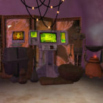
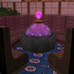
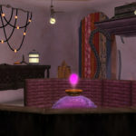
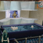
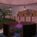
Even a blocky or pixelated antique video game building feels more real and immersive to me if I can harness whatever passes for nature in the game world. Fountains and running water are a big part of that (the hot tub in my pics is actually just a fountain with a few ottomans tucked inside so you can sit in it). Plants can fill up any dead corner and feel fresh but neutral, even in a high-tech setting like my old SWG bunker below. And in the isometric Ultima Online, I made sure to layer my buildings with rooftop terrace areas, fountains, and gardens.
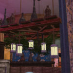
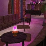
I don’t want to overlook lighting, either. On Napyet’s podcast a while back, I joked that I had an obsession with SWG’s Life Day Bunting because it looks like glowing fairy lights. I live for those pink orbs, fireplaces, and incense burners too; lighting sets the mood and makes the room feel dynamic, especially when it’s literally animated and flickering (or if you can turn it off and on, as you can in UO). I’m also really attached to violet and teal and warm golden lighting – I used it in my old supergroup base in City of Heroes, too. It’s not the best-decorated base at all, but who cares? Glow baby glow.
It’s all in the details
We’re drilling down to the little bits now, the details, the smaller objects and fiddly bits, the clusters of items, and this part is really hard because the line between “cluttery hot mess” and “eye-catching focal point” is basically imperceptible. You know it only when you see it. These are my rules of thumb:
- Consider functionality, storage, and purpose
- Create scenes and vignettes
- How many chairs ya got? Cool, now add more
- Repeat inexpensive objects
- Embrace both symmetry and asymmetry
- Balance extreme detail with scale and space and air (don’t overwhelm)
- Stack and rotate objects into new objects.
When I go to build a house from scratch, as in Trove or UO, I actually start with a list of what I need to create space for: my crafting stations, my rune library, my forge, my fireplace, water troughs and trees and staircases. I intentionally build space for those things in ahead of time; eventually, you learn the rules, like exactly how many tiles your fireplace or staircase needs to work across multiple floors.
That’s not quite as doable with the prefab buildings of SWG; there, I start with deciding what each room will be used for and where the vendors and showroom items and resource storage needs to go, then decorate around that. I understand that SWG Legends is considering resource storage that’s a little more organized than my “row of cabinets,” but I’m still all about those cabinets for now.
Once those necessities are taken care of, everything else is fun fluff, so I work on creating little scenes and vignettes, with plenty of extra seating, not just so that guests and I can literally sit down but because it adds to the realism. In my current shop, that means a bar area, a lounge, a stage, a leaky basement, a shrine, a conference room, a workshop. And, you know, my hot tub! In past homes, I’ve tried to build bedrooms, kitchens, bars, offices, with as much detail as I can. My ace pilot even had a decorated YT-1300!
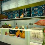
One of my favorite tricks in real life is finding something super inexpensive and repeating it in clusters so that its cool factor and consistency distract from its cheapness. In SWG, I have some favorite objects I’ve been doing this with for years: rugs, pillows, chairs, vases, abstract paintings, candles, baskets, and so on. In other games, like UO and Trove, I do it with flowers and architectural oddities.
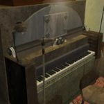
That same trick applies to taking items and moving them around so they look like something else. I’m far from an expert at this, so I’ve dipped into my stash of shots of other folks’ houses to demonstrate too – all of these are from the original live servers, so they’re all gone now and I have no idea who originally made them. But these creative souls crafted pianos, pool tables, stoves, laboratories, and so much more by using items turned upside down, flipped backward, and floated up in the air.
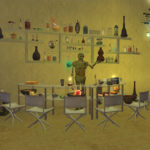
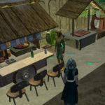
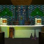
Humans love symmetry as much as asymmetry, but only if the symmetry is exact, and only if the asymmetry is still balanced overall. I try to use both; too much symmetry can make the room look cheap and stagey, but a little can give an appearance of organization. See how in the first pic below, the vendors and plants are symmetrical, but the jawa vendor and bottles display aren’t – and yet their visual weight sort of balances? (I actually won one of SOE’s homeshows for that diner, way back in the day!)
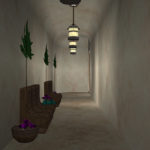
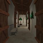
Even so, not every room needs to be stuffed with items at all. Give guests (and yourself) a visual breather too with rooms (or hallways, in my case) that have a minimum of items. Not-decorating might be even harder than decorating, especially in a video game. I’m certainly not great at it, but I believe in the principle!
For you video people
You made it this far through piles of screenshots! Now you deserve some videos.
In 2016, I finally posted this old video from 2011 (it says 2012, but it was actually 2011). I must have hopped into the game right before the sunset and wandered through my houses, from my teahouse to my workshop and then my diner on my backup server too. It’s blurry as heck and there’s no narration, but here it is for posterity’s sake. It’s what I’ve got left. (The screenshots just show it off better.)
Finally, I promised a quick walkthrough of my current teahouse on Omega, which ought to give a clearer picture of the layout than the pics I used as examples above. It’s always changing, but here’s the most recent version. (There’s a bit of voiceover on this one.)
Destruction in an MMO is easy and cheap. We’re constantly being asked to be a murder hobo, and 23 years in, I frequently grow bored of it. But construction? Construction is harder to find. And beautiful construction is rare. That’s my goal. So get to it: Go inside an MMO, build something, and break every single one of my rules.
 The MMORPG genre might be “working as intended,” but it can be so much more. Join Massively Overpowered Editor-in-Chief Bree Royce in her Working As Intended column for editorials about and meanderings through MMO design, ancient history, and wishful thinking. Armchair not included.
