Last Tuesday I woke in the wee hours of the morning to install Star Citizen’s 1.2 patch. I wasn’t battling insomnia or anything like that; on the contrary, I set my alarm and made sure to start the mammoth download so that it would be finished when I rolled out of bed for real.
Why not Monday or even last week when the patch released? Because I fall under Comcast’s internet monopoly, and one of the many reasons Comcast sucks is the 300 GB limit on my “unlimited” plan. Since Star Citizen’s social module is a whopping 30 GB download, I had to wait until Tuesday and the start of September to avoid a fee!
After my epic overnight download was complete, I spent a couple of hours playing around in the newly released social module. Even though it’s clearly a pre-alpha rough cut, I feel that Star Citizen is starting to come together.
Too much information
I’ve burned out on alphas and betas in recent years, which makes my Star Citizen dabbling this week all the more encouraging. It’s not that I’m looking forward to the game any less than I was in 2013 or 2014 when I was cranking this column out on a weekly basis, but Cloud Imperium has helped me realize that seeing how the cake is baked isn’t as fun as eating it. Or as Patton Oswalt once explained, “I don’t care where the stuff I love comes from, I just love the stuff I love.” I may have paraphrased that a tiny bit to protect the innocent, but info overload is why I’ve basically checked out of hardcore Star Citizen fandom in recent months.
There’s just too much, you know? Following this title’s open development process and its dozens of weekly updates is literally a full-time job that leaves little room for playing released games, so I’ve adopted the same approach that I took during Star Wars: Galaxies‘ early beta all those years ago: I log in every couple of months to see if stuff in general is still to my liking, but I’m reserving serious play and research time for post-launch.
 Your first step into a larger world
The social module, a planetary landing zone called ArcCorp Area 18 in the game’s fiction, is definitely to my liking. It’s Star Citizen’s first step into a larger world, and if this tease is any indication, what a world it’s going to be! Currently there’s not a lot to do in gameplay terms other than explore, but I spent a couple of hours wandering along the catwalks and back alleys of this initial zone doing just that.
 Cloud Imperium’s artists and world-builders have outdone themselves; this particular slice of the game perfectly captures the ambiance I was expecting when I saw this piece of concept art way back in 2012. Area 18 boasts a grimy, lived-in visual palette that looks the way you’d expect a heavily industrialized and heavily traveled starport to look in the 30th century.
It’s not the dark, dank, sky-on-fire dreamscape of Blade Runner. It’s also not the plasticky pastel milieu of insert-stylized-MMO-here. Instead, it’s a plausible, working man’s aesthetic that’s the same sort of dirtysexy authentic as that full-size Millennium Falcon prop from the Empire Strikes Back’s Hoth hangar bay.
Crucially, Area 18 doesn’t look or feel like a crappy matte painting or a fake-ass digital composite; it looks and feels like an actual place where actual pilots, traders, mercenaries, and hustlers ply their wares and sneak around to rest, refit, and refuel.
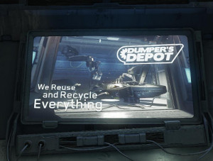
 True to Chris Roberts‘ long-standing love of immersion, CIG has filled Area 18 with lore-centric advertisements for everything from spaceships to sports to guns and ammo. Similarly, there are lots of little touches like visible scratches on various signage, puddles of standing water and refuse-strewn alleyways with occasionally readable refuse, and a slick “augmented reality display system,” which projects critical gameplay info like player names through an immersive though currently incomplete UI element.
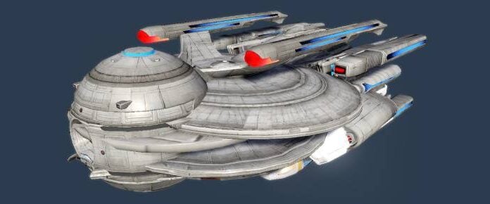
Oh, and try not to squee like I did when you wander into the Astro Armada showroom, a spit-shined monument to modern starship production complete with an M50 on a rotating pedestal and an in-character sales pitch looping over the PA system much like your local auto dealership.
But can I run it?
The NPC population is pretty sparse at the moment, and you can’t really interact with shopkeepers or security personnel as of today. That said, the level of visual detail already apparent on both the NPC faces and their gear is just short of mind-blowing.
Performance is impressive, too, even though my rig (4 Ghz i7 4790 with 8 GB of RAM and a couple of GTX970s) isn’t exactly cutting-edge anymore. According to Fraps, I never dropped below 30 frames per second even though I maxed all of the graphical settings.
Pressing F12 inside ArcCorp brings up a rudimentary chat box, and you’ll share the local channel with up to 24 other players during this first release phase. You can press F6 to cycle through a few different armor looks, and CIG has included several /emotes as well. Avatar customization is currently non-existent, though as persistent universe director Tony Zurovec explained in last week’s introduction post, the social module is really just a foundation for the rest of the game at this point.
 A solid foundation
CIG plans to roll out everything from shared hangars to simulated games to group space engagements as functionality upgrades to the current social module, not to mention avatar customization options through the module’s various merchant locations.
Perhaps the most gratifying part of my stroll through the social module is the knowledge that this is just a tiny part of Star Citizen’s vast universe. CIG has already teased another landing zone release with a layout and a visual environment that differs dramatically from Area 18. When I think of visiting dozens of dissimilar planets in hundreds of far flung star systems, all with this level of detail and wrapped around a flight sim core with ground-based FPS shenanigans and a sandbox economy, frankly it makes me think that Star Citizen is in fact under-hyped.
Even at this early stage, the social module was well worth waking up at an ungodly hour to start a 30 GB download!


