

Earlier this year, MMO Folklorist posted a rather intriguing article about the 10 best MMO box art designs — at least in his opinion. It was a fun read and prompted me to do what any creatively starved writer does, which is to blatantly steal the idea for my own. While giving credit. Hey, I’m a thoughtful thief! (But seriously, check out MMO Folklorist!)
So for a fun puff piece, I went through dozens upon dozens of box art designs for MMOs both new and old to pick the 10 that I thought were the most striking, artistic, and downright eye-catching.
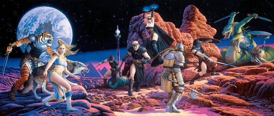
EverQuest: Shadows of Luclin
Historically, EverQuest has had some of the absolute best fantasy art gracing its core game and many, many expansions (back when they were boxed and not solely digital, that is). They always featured a variety of in-game races, prominently featured the title’s scantily clad mascot elf, and made EverQuest look like this thrill-a-minute action experience. While all of the covers are generally great, I liked this expansion’s for the oddity of being on a moon with the planet in the sky.
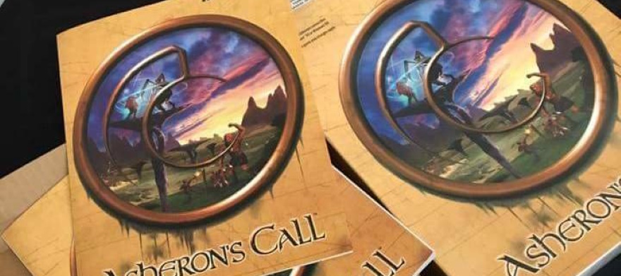
Asheron’s Call
I have so many memories of going to my local Media Play in the early 2000s and having my eye caught by Asheron’s Call’s box design. I really liked how it was an invitation of sorts, putting the viewer in the position of looking through a dingy window or portal into this vivid fantasy realm with strange creatures and floating platforms.
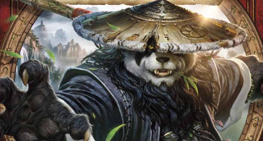
World of Warcraft: Mists of Pandaria
All of the WoW boxes are decent, but if I had to pick one that really pops, it’s the one with the panda. I love that this character is coming right out of that runic circle to either grab or attack the viewer, and that single eye peeking out from the damaged hat is pretty hardcore. Not my favorite expansion, but I’d gladly hang a poster of this somewhere in my home.
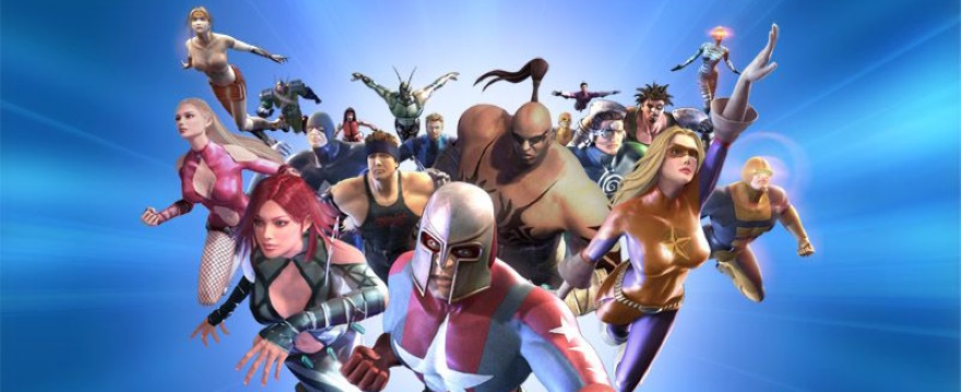
City of Heroes
The simplicity of this “explosion of good guys” coming right at you not only features the game’s principle cast of characters but also — at least to me — tantalizes one with the potential and possibilities of making a wide variety of superheroes.
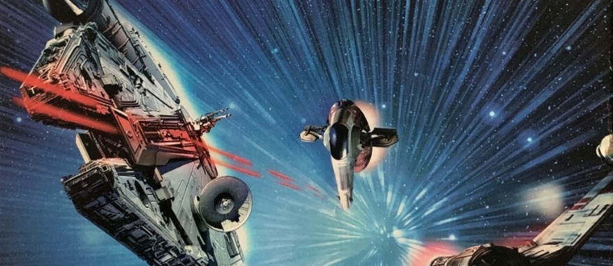
Star Wars Galaxies: Jump to Lightspeed
While the original SWG box art is, frankly, quite dull (whee, it’s the logo and some starssss), I love the energy blasting out of Jump to Lightspeed’s design. You’ve got an X-Wing, Slave One, and the Millennium Falcon zipping through space and blasting turbolasers. Just looking at this makes me want to jump into a cockpit and join the fun.
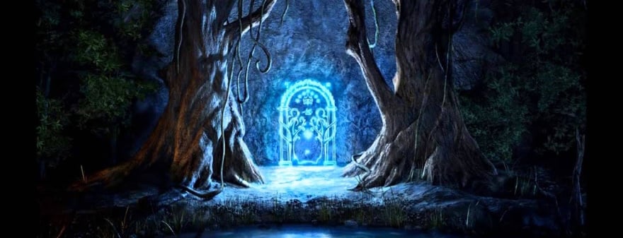
Lord of the Rings Online: Mines of Moria
Maybe expansions get all the good cover art? In any case, I’ve always loved this look to Mines of Moria’s box art. By framing the glowing Hollin Gate with dark, foreboding trees, shadows, and a still (for now) pool, it’s a blatant invitation to explore what might be inside of those iconic doors.
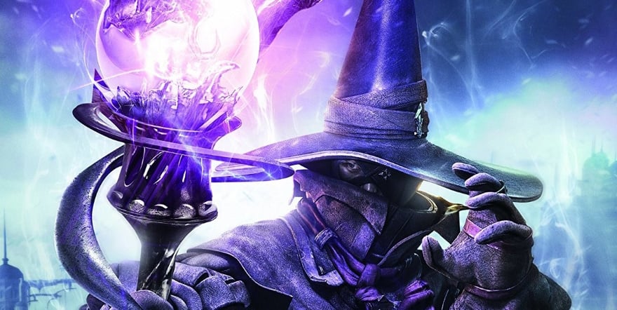
Final Fantasy XIV: A Realm Reborn
FFXIV has a whole lot of box art and variations, many of which feature the standard JRPG “jam everybody’s head together like they’re in a mosh pit” format. But there are exceptions, such as this above PlayStation 4 ARR cover. The focus on what I assume to be a Black Mage in the midst of casting gives it a sense of energy and movement, and once again we get that solitary eye poking out for maximum effect. Plus, it just looks cool.

Uru: Ages Beyond Myst
I’m going with a deep cut for this next entry, for sure. Uru Online’s box art does a great job connecting to the franchise with an intriguing island jutting up out of the fog, but in this case it looks to be more primitive and bare. It definitely evokes memories of Myst back in the day. I also liked the title font (not pictured) which adds a lot of character as well.
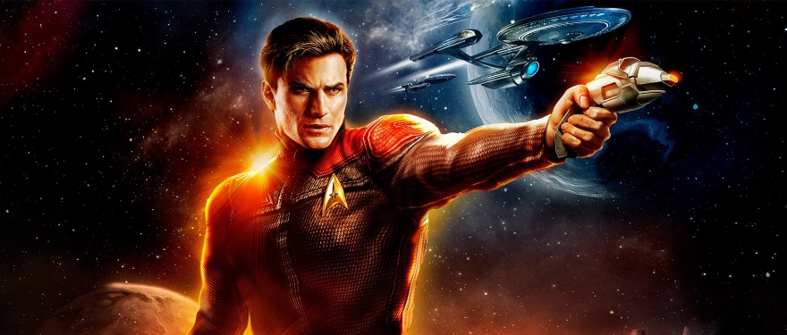
Star Trek Online
While STO has had a lot of great pieces of promotional art (which I don’t consider actual box art), I do have a fondness for the original design. We got Captain Chiseled Jaw here pointing a phaser with starships zooming past his shoulder. What I liked about this is that it subtly informs the viewer that this game is full of familiar elements that are nevertheless updated for the even-more-futuristic setting than the show. You can especially see that in the faux-Enterprise design.
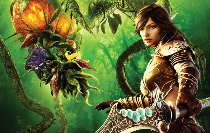
RIFT
At first glance, this cover follows the pretty standard “have your main mascot character posing in front of a fantasy realm” standard. But I feel that there are a couple things that make RIFT’s art stand out. First, it’s wonderfully detailed — just look at the filigree on that sword or the layers to the background. And second, the sheer weirdness of this angry-looking plant thing coming down from the heavens is visually arresting and gives a “wild” vibe right from the get go.
 Everyone likes a good list, and we are no different! Perfect Ten takes an MMO topic and divvies it up into 10 delicious, entertaining, and often informative segments for your snacking pleasure. Got a good idea for a list? Email us at justin@massivelyop.com or eliot@massivelyop.com with the subject line “Perfect Ten.”


