
It turns out that MMORPG players really don’t need much prompting to go out and take a bazillion screenshots of their favorite in-game zones, as evidenced by the avalanche of photos generated by last week’s challenge.
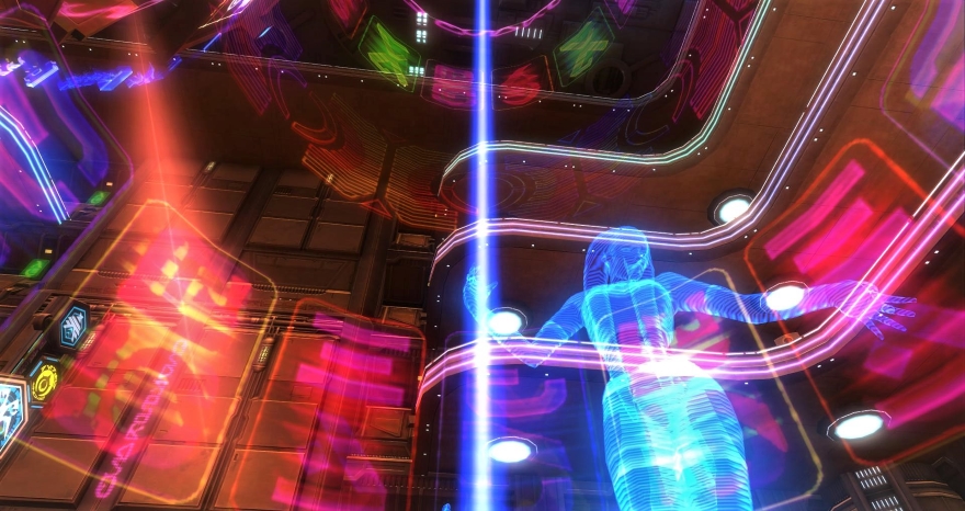
SmugglerSteel kicks us off this this neon nightmare: “I knew exactly where I needed to tour in SWTOR for this one. I will always remember my first trip to Nar Shaddaa. I was blown away away by the color and aesthetic. I always thought it had a very Bladerunner inspired feel, yet still did it’s own thing.”
Like any good casino, Nar Shaddaa is designed so that players can never figure out how to leave. SmugglerSteel forwards his mail there now.
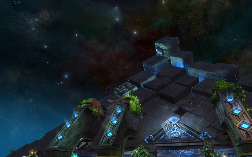
If you don’t want to go to the stars, but merely gaze at them, here’s a great picture of a gorgeous night skybox.
“Since I have been mostly playing Guild Wars 2 lately, here is the favorite zone from those seen so far: Rata Sum at night,” said ESD. “Mostly because of the sky — it’s nice being above the clouds.”
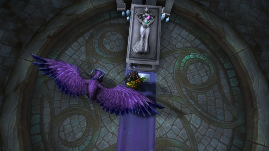
In many instances, it was tough to pick just one screenshot from the sets that readers left in the comments. I always try to go with my gut as to the most eye-catching, and I think Winter achieved that here with this picture from World of Warcraft’s Suramar. Nice angle, elf grave, what’s not to love?
Turns out that Vincent has been having way too much fun in Final Fantasy XIV: “I’ve posted shots of this zone before, so the challenge was taking some new shots… but hands down, Azim Steppe is one of my favorite zones in the Stormblood expansion.”
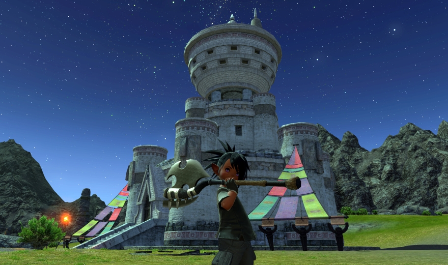
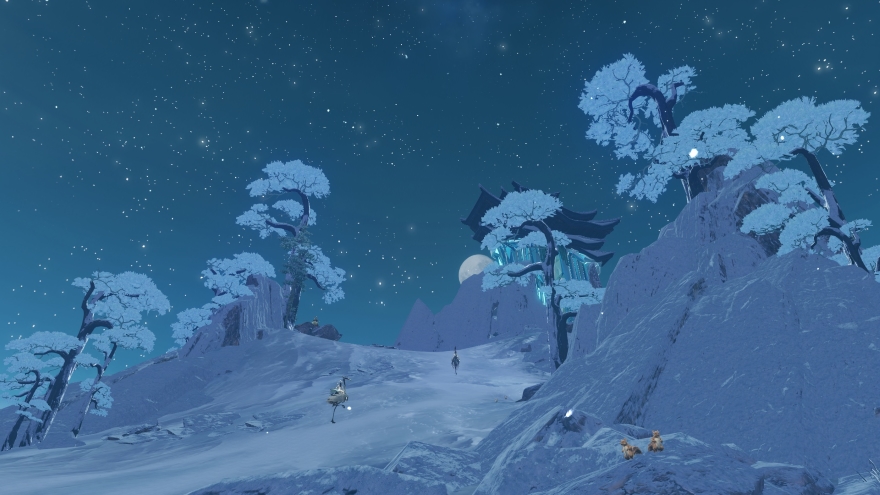
“Right now I play Revelation Online,” said Minimalistway. “The game has a world but no zones. It does offer a camera feature, the catnip for people who like to walk around and take screenshots.”
I really thought that this snowy scene was starkly beautiful. What do you think?
OK, we’ve seen the best in MMO zones — what about the worst? This week’s screenshot challenge is to take a picture of the ugliest or most poorly designed zone in an online game and explain to us just what is so bad about it.
 Every week, One Shots shines a spotlight on the best community screenshots from your MMO adventures. If you have a great pic to share, email it to justin@massivelyop.com with the subject “One Shots.” Make sure that the picture is over 880px wide and comes with a description or story!


