
Back when I was taking a smattering of business classes in college, one of my favorite electives dealt with marketing. It wasn’t that I wanted to be a marketer, mind you, but I became fascinated with the intersection between design/art and psychological manipulation. To this day, I still observe and dissect various logos that I encounter in the wilds (of suburbia) to see if I can figure out what they’re trying to communicate and how they’re trying to appeal to me.
So why not do that with MMO logos as well? Today I’ll be looking at 10 title logos for various MMORPGs to see what they “say” beyond the name themselves. This list won’t be concerned with expansion logos or wordless artwork; I simply wanted to see what various studios did with the title of the product itself.
![]()
I want to start with the inspiration behind this column, which is — oddly enough — the recent Embers Adrift. The more I’ve looked at this logo, the more I kind of adore it. The orange color for the “Embers” and the tiny specks flying off the top certainly do suggest the embers of a fire, with the small cracks sort of looking like how wood cracks while it’s on fire.
But then this feeds into the much larger “Adrift” underneath it, which either supposed to be ash or stone. I like the ash angle, but either works to give you the impression of something coming apart. The “A” is relatively intact, but the further right you go, the more things shatter. The “T” is barely there any more, getting swept away along with the tail of the “R.”
All in all, it’s a very dynamic logo that gives off hints of apocalyptic danger. I think it’s kind of brilliant.
![]()
Let’s move on to a rather ostentatious logo, which is for Star Wars: The Old Republic. There are two jobs that this logo has to do: carry on the Star Wars name and connect to the Knights of the Old Republic franchise. I think it does both well.
The “Star Wars” uses the very traditional and familiar font for the whole franchise, albeit glazed in gradient bronze. That bronze and the rest of the logo certainly harken back to the design of KOTOR, although this version is far more ornate with a sandwich of filigree on the top and bottom of “Old Republic.”
It’s a bit too much for my taste, even if I acknowledge that it does a good job connecting to the franchise and giving the impression of a refined civilization at the height of its power.
![]()
If I were giving logos a grade, Trove would deserve an A+. It really excels the more you study it. First of all, it nails simplicity — there’s nothing that complex at play here. The bluegreen-and-yellow color combination contrasts wonderfully with a subtle gradient. And there’s a nice retro Atari 2600 vibe with the pixelated font.
So it’s telling you that this is a retro-themed game for starters, but there’s more than that. At the center is this giant yellow cube (the “O”) bursting out of the confines of the logo and drawing the eye. This is a game that’s heavily inspired by Minecraft and its cubed ilk, and so Trove wants to put this design element up front and literally center. It’s so hard not to have your eye drawn back to that center even if you try to look at other parts of the logo. Well done indeed.
![]()
Like the SWTOR logo, Lord of the Rings Online’s benefits greatly by cribbing from its famous source material. This logo could’ve been lifted right out of the movie or book cover, with the elaborate swashes and flourishes evoking thoughts of past eras with greater refinement.
There’s a lot of familiarity with the Middle-earth franchise, but let’s go beyond the title to see some other touches at play here. The whole logo is set in a shield boasting its own corner ornamentation that frames the title well. And then there’s a nice subtle repeating background of what I say are pineapples but I know are simply decorations that lend to this image of high-quality and royalty.
![]()
So let’s go back — way, way back — with this next one, the O.G. RuneScape logo. Objectively, this is terrible. It screams “low budget late-’90s made with MS Paint” at its core, what with the curvy font superimposed on variously shaped rocks and a sword awkwardly thrust between them. I guess it was trying to bring home the whole “rune” concept, but what it communicated was “amateur hour.”
And yet this logo proves that even the cheesiest of designs can be embraced and even loved over time due to association with a popular product. There’s something admirable about the early bootstrap days of this MMO, and those nine rocks and that Excalibur-wannabe remind players of the great days of the past. There’s a reason why Old School RuneScape kept this design while RuneScape proper adopted a more artistic yet less personable logo.
![]()
Here’s another newer logo that I rather like! The focus here is clearly selling the Age of Exploration feel with the font choice. It’s bold in its presentation and spacing, kind of like the title of a movie coming at you. But there are some other nice touches here as well: the little chips off the letters (“That gives it character!” my internal dad voice says) and the crossed hatchets. In fact, the hatchets and the bleeding from the diamond and the piercing of the “O” all hint at the bloody combat within.
You know it’s a good logo when you can identify it from a long way off — or even without the letters.
![]()
If you compare it to the first game’s logo, Guild Wars 2 has an identity and refinement all its own. The font is eye-catching with its missing bits, towering letters, and sharp edges. But, of course, it’s overshadowed by the mighty 2 — and this is where the eye is drawn. It’s towering over the rest of the title, fashioned into an aggressive-looking dragon (don’t overlook the fact that the bottom part of the 2 becomes the dragon’s wings and claws). The way the 2 is done also points to the “painterly” look for which this MMO is known.
And black and red and white as a color scheme is incredibly striking. It’s a logo that gets in your face and promises an intense experience for its product.
![]()
EVE Online’s logo may be one of the simpler entries for today’s list, but let’s not count it out just yet. Simplicity coupled with good design can be a perfect combination for public identification.
So what do we have here? The nearly asymmetrical “EVE” here is highlighted as the key element. The font is futuristic, especially with the unusual “E” lettering, and the V extends down beneath the rest. I’m divided whether this evokes imagines of spaceships, cold corporate imaging, or a sort of flag, but in any case it’s distinctive and works well laid on top of any promotional art.
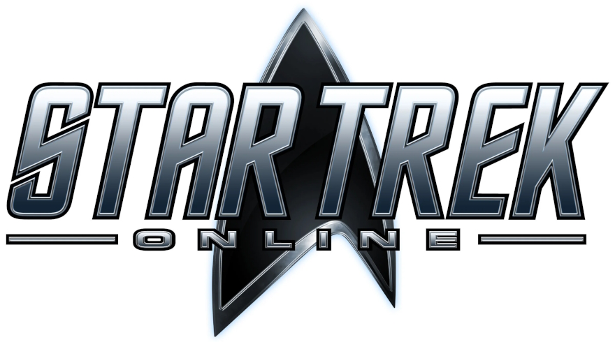
Here’s a good example of hewing to your I.P. if you have one. There’s nothing here that’s original — but it is very, very familiar to Star Trek fans. The font is the classic Star Trek title font, with the Federation shield behind it. This version also doesn’t mess around too much with colors, sticking with a glossy steel grey and black to look like a metallic pin or plaque.
This is exactly what you want to do if you are looking to reach out to a steadfast, loyal fanbase and say, “We know and respect the franchise — and you’ll find more of what you love in this game!”
![]()
I began this list with a bit of an odd pick, so I’ll end it the same way. Yet I think No Man’s Sky deserves the nod. This logo always stuck out at me as very well-done for a few reasons. First, the font is fun and appropriately future-facing (and is similar to some of the fonts that NASA uses). Second, it’s simple, clean, and leans into this strangely worded title.
But the third and final reason this is quite good is the icon that’s floating above center. I’ve always found this to be an ominous, alien object, with a hint of a red orb like the red eye of HAL-9000. It immediately makes players wonder what it is and why it’s featured so prominently. And why is most of it black but a bit of it white? It’s an icon of mystery, begging to be solved.
 Everyone likes a good list, and we are no different! Perfect Ten takes an MMO topic and divvies it up into 10 delicious, entertaining, and often informative segments for your snacking pleasure. Got a good idea for a list? Email us at justin@massivelyop.com or eliot@massivelyop.com with the subject line “Perfect Ten.”


")


